
Blue Magic: Color psychology as an ally to Black women
Black women rocking bold colors should be the name of a coffee book, and we know the photos would be stunning. Throughout history, Black women have embraced vibrant hues, cultivating patterns and complicated textures – telling stories through color.
“If a person is drawn to colors that are bolder, it shows more confidence and someone you can trust,” says Amy Wax, color expert and creator of the Color911 App.
Our staff at Notable wanted to dig a little deeper and examine what our color choices say about us and how we can use color to our advantage in the workplace.
“Color communicates, color shifts, color participates,” says Michelle Lewis, color psychology expert. “I believe it was created to support us. Our hormones run off it; our sleep cycle runs off of it. Our mood, in a lot of ways, runs off it.”
From years of studying color, Lewis believes it should be embraced and used as a tool and an ally. “I think it is boundariless in terms of what we can do to bring it into our situation.”
Whatever you are experiencing, Wax believes that color is a part of everything we do, starting with when we get dressed for work. “It is such a subliminal part of who we are,” she says. For example, she says wearing or seeing all white looks well-organized, pure and fresh. It’s giving Lisa Raye or Mother of the Church.
On the other hand, Lewis says there are other colors, like grey, which can mute personality over time. “That’s what can lead to depression, disconnectivity and feeling ‘blah’ at work,” says Lewis. She says the problem is that most people are in a grey work environment, and then they go to work every day wearing Black and wonder why they’re miserable.
We have been conditioned to wear Black at work for interviews or big meetings, and while it can be seen as unassuming, Lewis says it can have the opposite effect. “It’s what’s become a cultural norm in a work environment,” she says. “But you’re not going to stand out at all.”
Lewis says there are eight primary communication colors that are behaviorally, culturally and scientifically part of our language and how we communicate.
BLUE
Both experts agree that Blue conveys trustworthiness, reliability, honesty and loyalty. If you are having a tough time at work, feeling harassed or overwhelmed, shades of blue are solid choices. “Deeper blues bring down blood pressure and heart rate,” says Lewis. “All they’re going to know is that they feel more trusting and calmer when they are around you.”
It is also a smart color to wear if you are looking to get hired or promoted.
ORANGE
It can be associated with balance and family. Not a typical work choice color for most people, it could have one of two effects on others, according to Lewis. “They are just going to avoid you because they are uncomfortable, and the color is saying cautionary traffic cone, or they’ll want to sit down on your couch, spend time with you and be your best friend.”
RED
Want to convey confidence, then consider red, with caution. Outside of holiday cheer, in the office, red can be seen as aggressive and cause overstimulation for those sharing office space. You may want to avoid this color if you are struggling with being bullied or harassed in the workplace.
PURPLE
Purple is driven and connection-based and can be a good color for building workplace relationships, camaraderie and collaboration.
YELLOW
Yellow is the most peak sensitivity in terms of what the eye can experience. It can keep you awake, energized and focused on your future. It can help you and others around you feel a little more joyful. On the flip side, it can also be overstimulating, especially with someone who is neurodivergent.
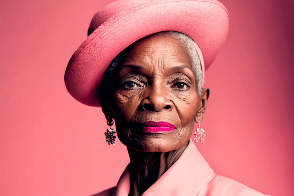
PINK
When you think of softness and femininity, pink is the first color to come to mind. It can make you feel comfortable when worn as clothing. However, as décor, it may cause you to retreat and not be as social or communicative. Studies have shown it to increase the desire to eat desserts.
MAGENTA
Magenta is very bold, revolutionary and stimulating. Think T-Mobile outpacing AT&T in sales. It is not a color to avoid, but you should wear it with caution in the workplace as it is connected with a few politically charged campaigns, such as the “Rock Against Reagan.”
GREEN
Green is balancing and is the most neutral to our eyes when perceiving color. It can affect heart rate and is helpful if you need stability in your office. An interesting fact about green is that it will bring you up when you feel down and vice versa, so use it carefully.
The Color Cure https://colorcured.com